

Understand the common user journeys to identify opportunities to engage users more effectively and meaningfully throughout their journey.
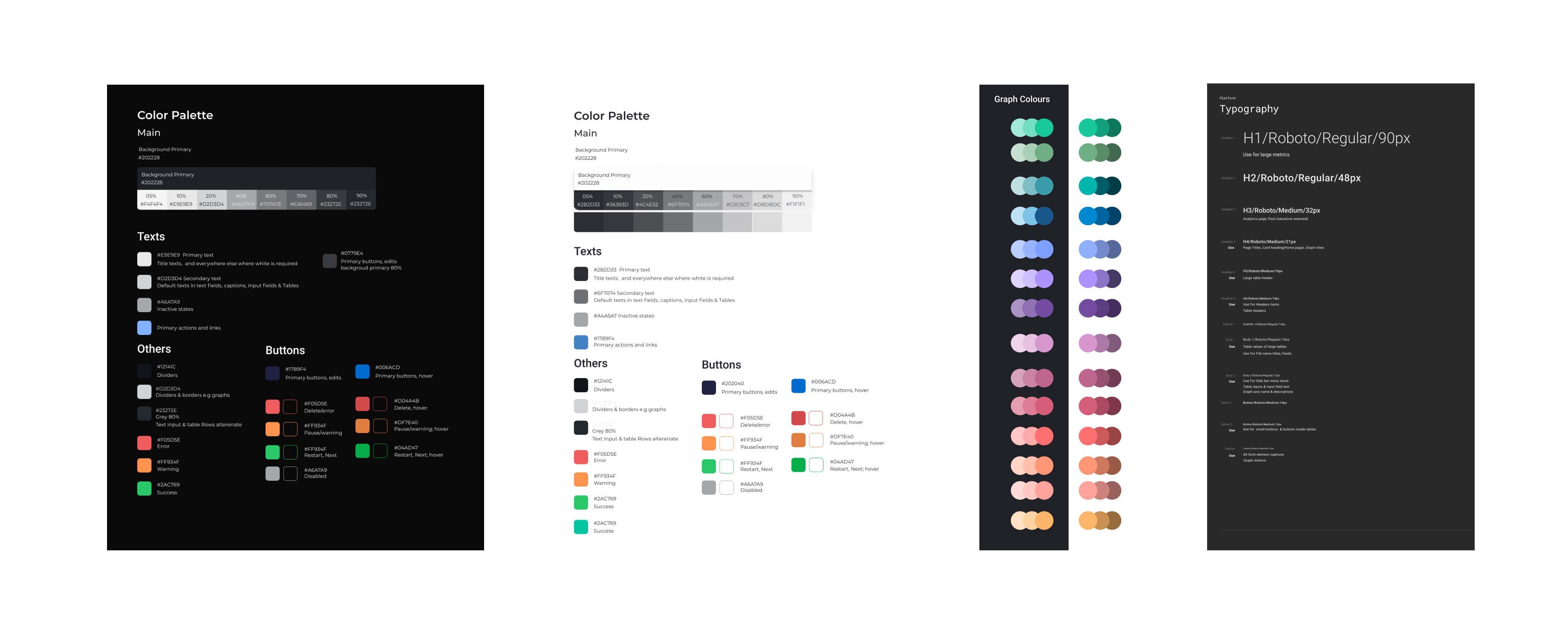
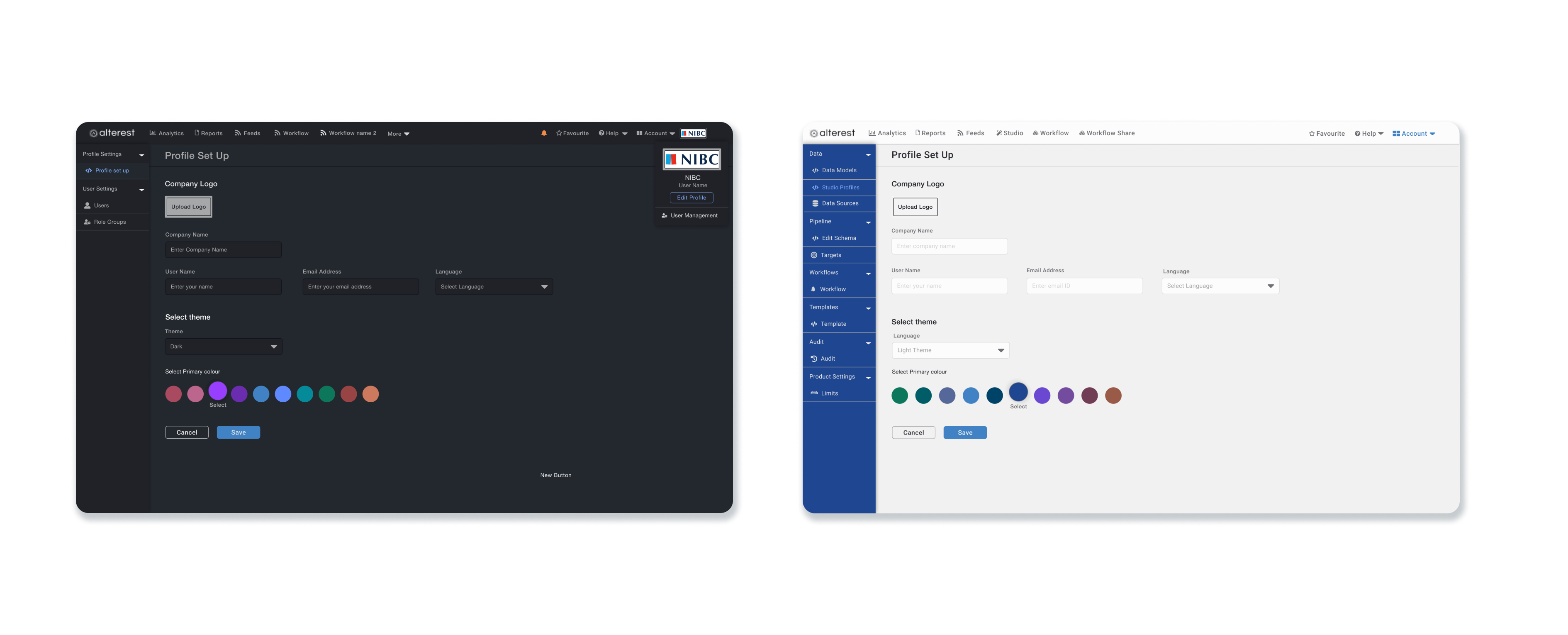
Set up a design system based on React Bootstrap framework for dark and light themes.
Set up user journeys, wireframes, conduct user testing and hence the UI for self-serving module.
I was the sole designer working cross functionally with the product owner, sales and customer service folks and developers.
User Research: User Interviews, Persona Mapping, Journey Mapping, Information architecture
Design: Sketches, Wireframing, Design system, Prototyping, Usability Testing
Figma and Balsamiq.


Users had trouble finding information quickly because of complicated navigation, causing frustration and inefficiency. Many users only used a part of the platform and hardly explored other features.
We could identify the happy path for our primary users and subsequently outlined the essential features needed to introduce a self-serve option.
Identified inconsistencies in the platform and problems such as confusing navigation, or missing features such as search and filter, and found unnecessary features for certain users.
Discovered that many of our users especially portfolio managers would prefer a light theme instead of the existing dark theme.
Established the user journey for the platform for simplifying the process of identifying opportunities, and reducing churn, guiding feature enhancements and product development.
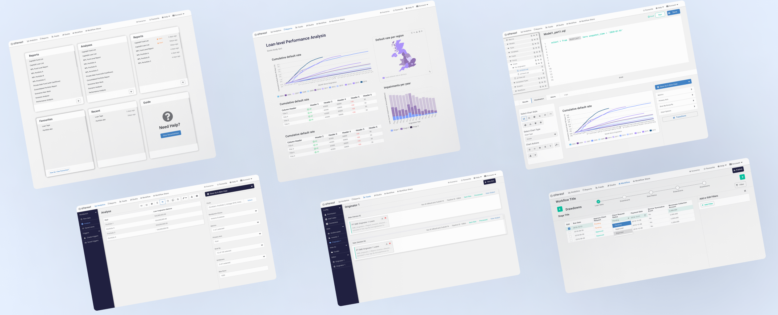
Drawing insights from contextual interviews with data champions—users adept at running basic SQL and proficient in utilizing the platform—we developed a user journey map for the self-serve feature. This map is designed to empower such users in setting up analytics and automating report generation.
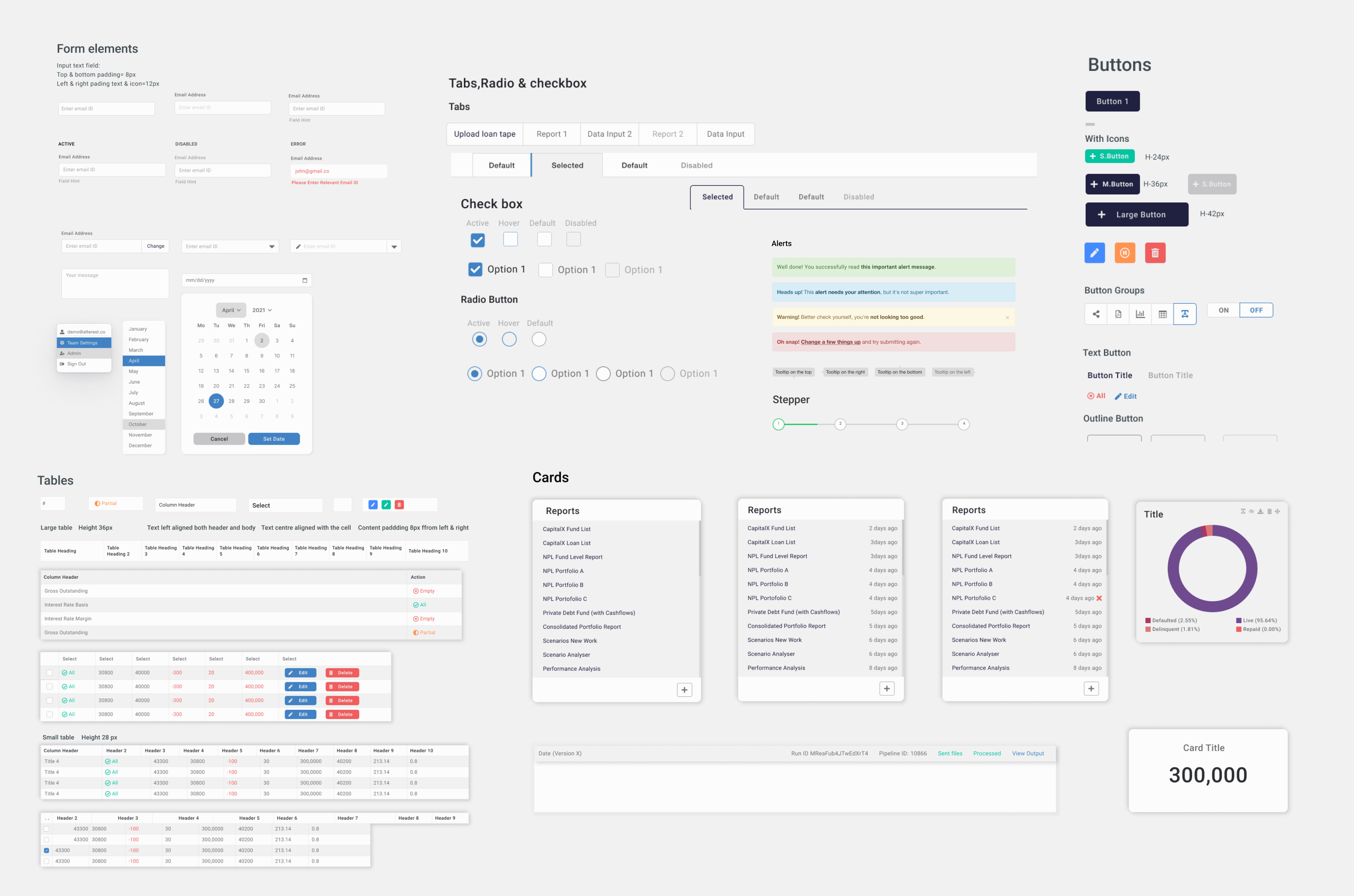
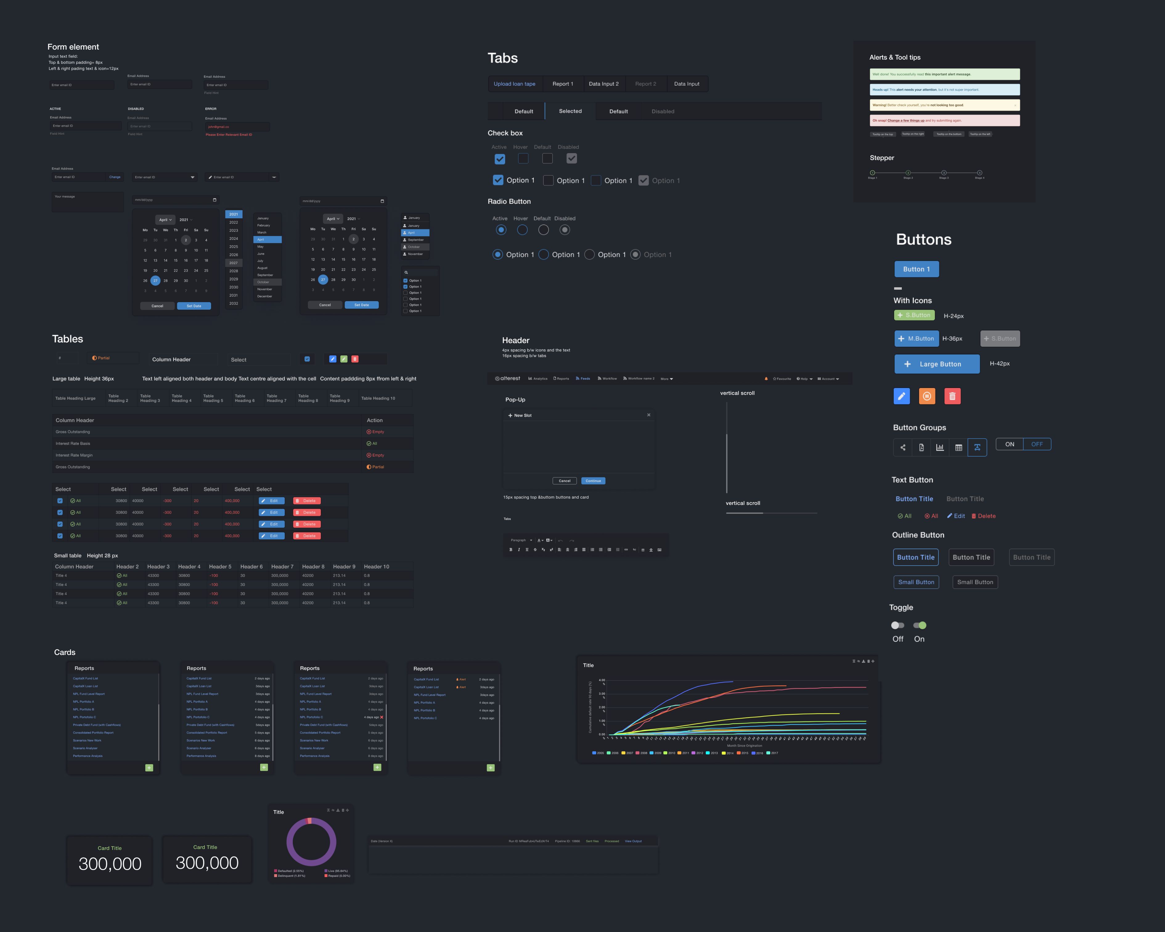
UI components
The aim was to design a reusable and user-friendly component library, comprising of essential UI elements such as icons, buttons, forms, tables, cards, and navigation menus. Also, easily customisable to cater to different design needs and requirements, and along with being responsive, adapting to various screen sizes and resolutions.
Improves efficiency by providing smart data mapping, data validation which standardise incoming data to making it easer to asses.
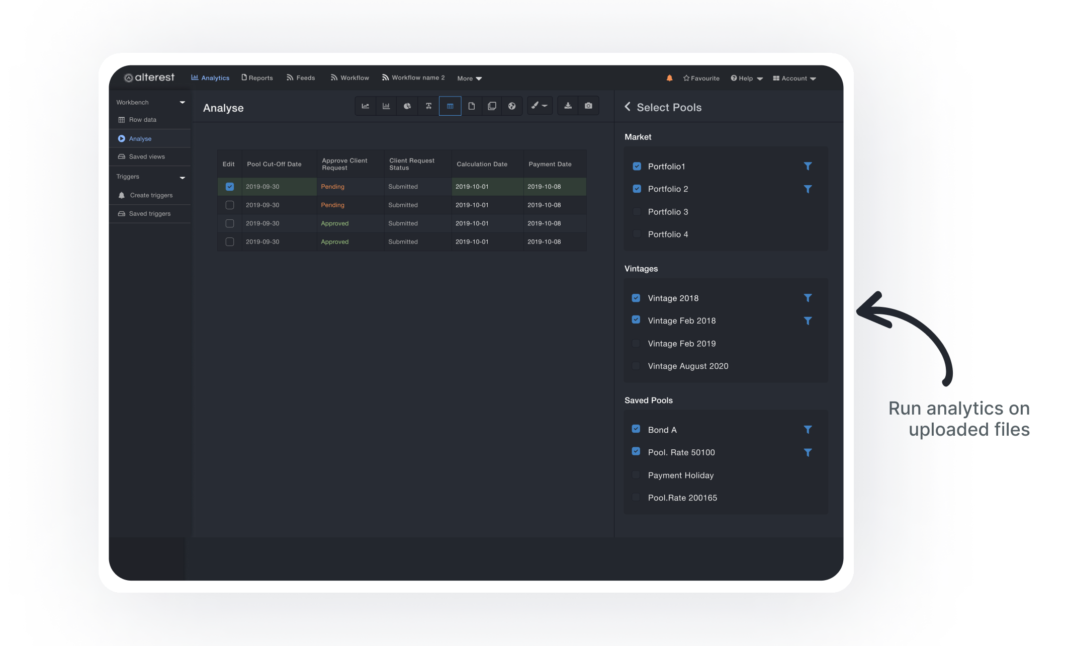
Enabled users to run analytics and generate visualizations for report generation. Allowed for loan level analysis, balance sheet management, credit monitoring, and management.
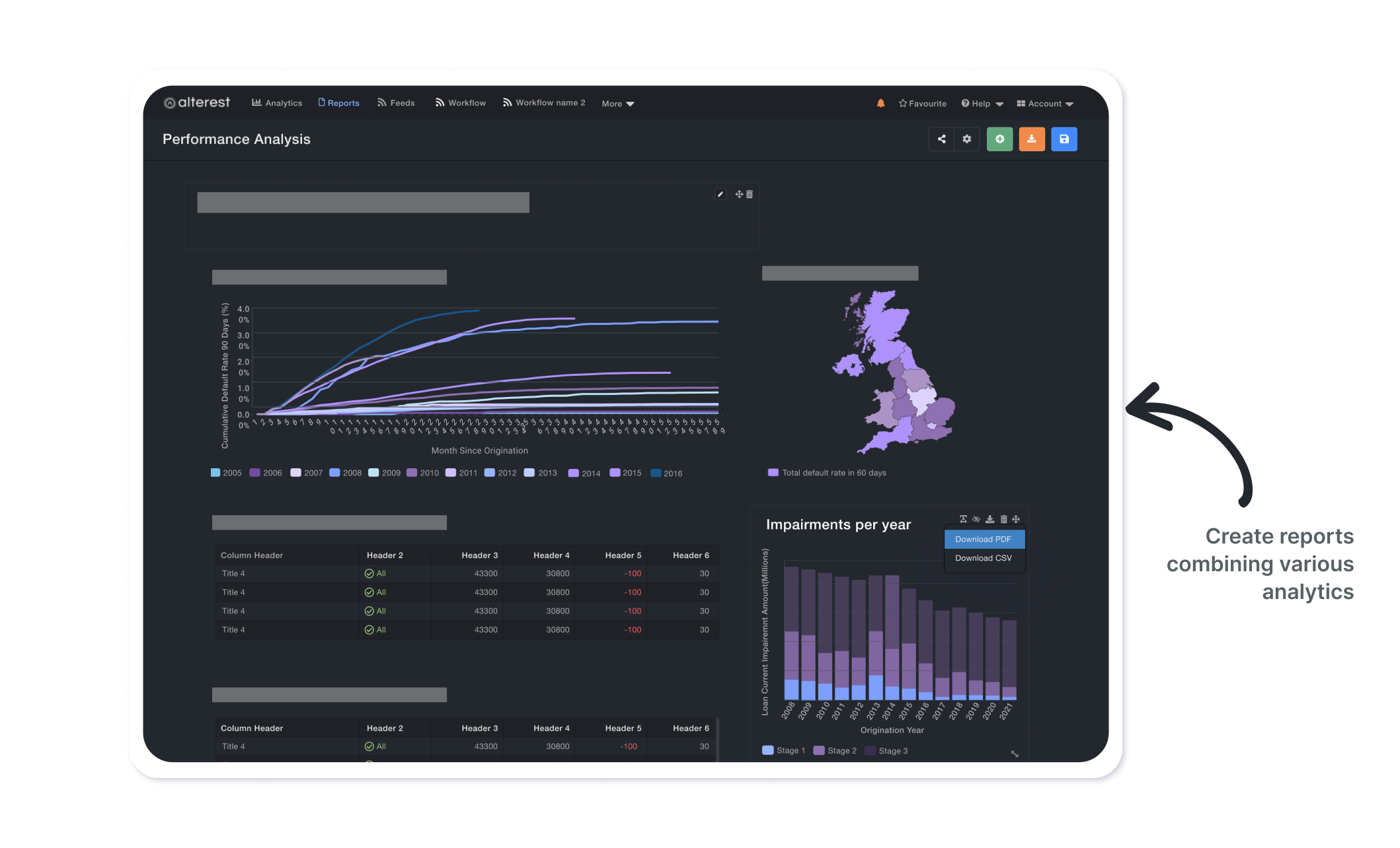
Various analytics generated were combined to produce templated reports, which were useful for meeting regulatory and official reporting requirements. The design for the reports module was updated, and the UI was improved to be more visually appealing for data visualization. Guidelines were established for converting the reports into printable, standardized formats.
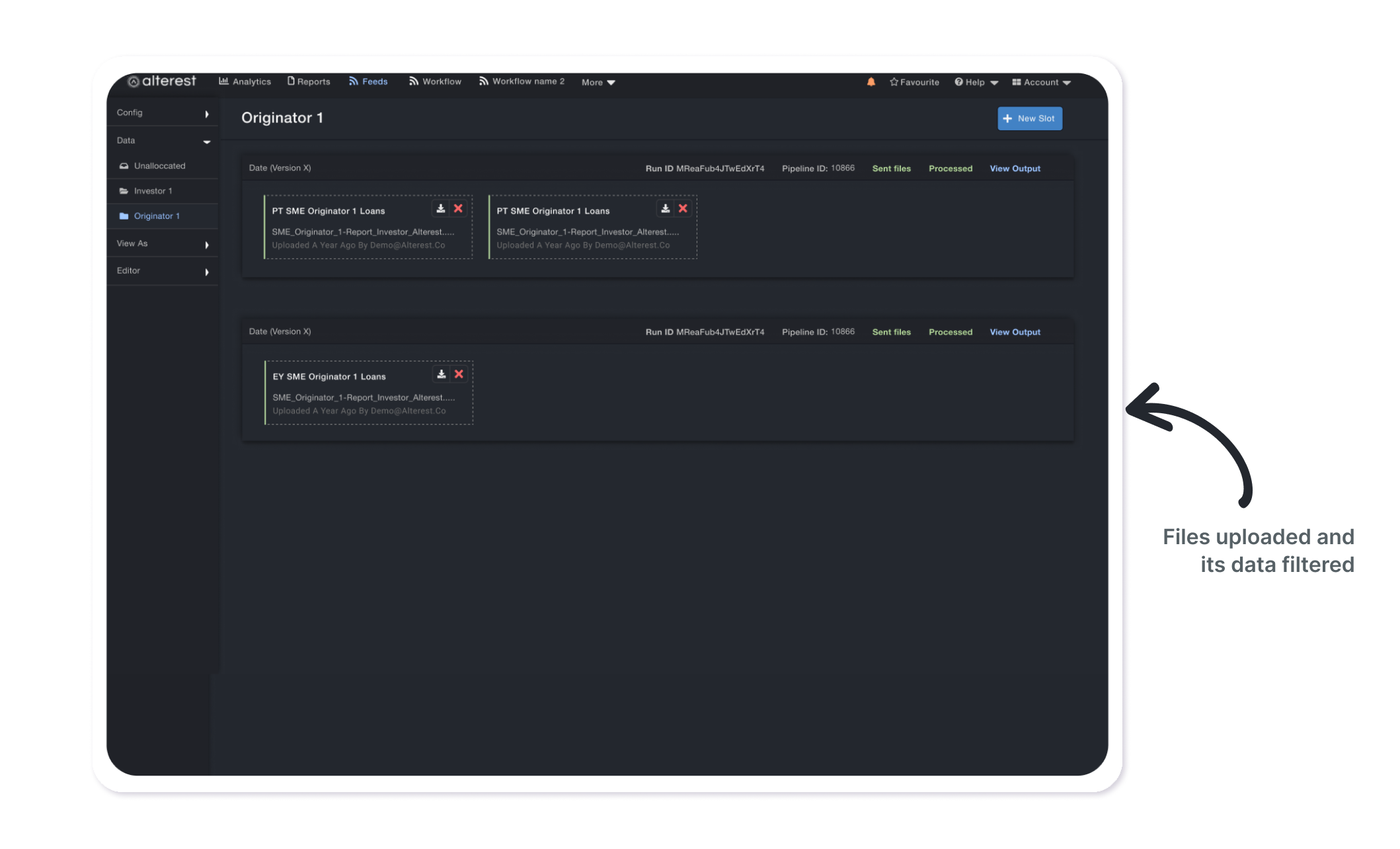
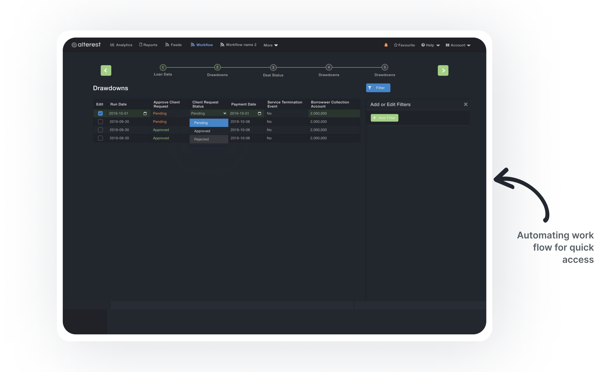
In 2020 I introduced a feature that automated data inception, analytics, and report generation pipeline for repetitive company processes. It was based on user insights and became the most used feature, leading to creating of a self-serve feature on the platform that the companies could themselves use to create their own workflows.
Self-serve feature of the platform that automates data ingestion, running analytics and generating reports through an intuitive UI and basic SQL knowledge.
As the platform was content heavy, a light theme improved the readability of text and other content on the platform, making it easier for users to see and understand the information presented.
A light theme design reduced eye strain and fatigue, making it more comfortable for users to use the platform for extended periods of time.
For users with visual impairments, a light theme with high contrast made the platform easier to navigate and use, improving accessibility.
A light theme design provided a cleaner, more visually appealing look to the platform, especially reports module making it more attractive to users.
Check out a quick prototype overview of the platform and the modeling layer; self-serve feature.
If you like what you see and want to work together, get in touch!
ishitadey.p@gmail.com


