

Happy Money is a consumer lending platform. I'm the design partner for originations, servicing, and partner channels.
Role
User research, UX/UI Design, and Usability testing.
Tools
Figma, Cursor, Claude design, FullStory, Sprig, and pen & paper.
Team
Product designer(me), Sr.product designer and Product managers.
Timeline
Apr 2025 - present
Pick a step to see what I worked on there.
What I built
I redesigned Happy Money’s homepage in Claude Design, and built a white-label pattern that lets Credit Karma, MSUFCU, and Experian carry their own brand into one shared funnel.
Results
+21% homepage engagement · Approved for Credit Karma’s Easy Apply funnel due to high completion rate.
What I built
The moment borrowers decide. I rebuilt the hierarchy around what they value most and scaled one card to cover 20+ different use cases.
Results
+14.9pp reduction in offers → verification · 68% faster decisions
What I built
The most fragile step. Borrowers verify income by linking a bank account; I rebuilt the page around trust and gave every failure a specific way back.
Results
Plaid selection increased from 76.5% → 86.5% · +11.7pp increase in verification rate.
What I built
Borrowers had to scroll about two full mobile screens to find the button to download their loan agreement, which they needed before they could sign off, and they couldn’t find it. I redesigned the step mobile-first so download and sign-off are easy to reach.
Results
Mobile-first redesign on the new design system, reducing customer frustration at the final step.
Building the design system
This change made it easier for users to understand task dependencies, especially in processes with multiple automations, without compromising print-friendliness.
See the foundation
+14.9pp offers → verification
Increased conversion from 21% → 36%, n=110K+users

Verification completion up by 11.7pp
Bank linking rate up from 76.5% to 86.5% and reduced Skip rate from 24% to 13%.

68% faster offer decisions
Reduced from 2:35 secs to 0:53 secs
.gif)
AI optimized one accessible design system
Every funnel screen runs on shared components that meet WCAG AA, so a fix lands everywhere at once.
Decisions weren't instant, after submitting, borrowers had to wait for an answer, so every screen needed to tell them clearly what was happening and what came next.

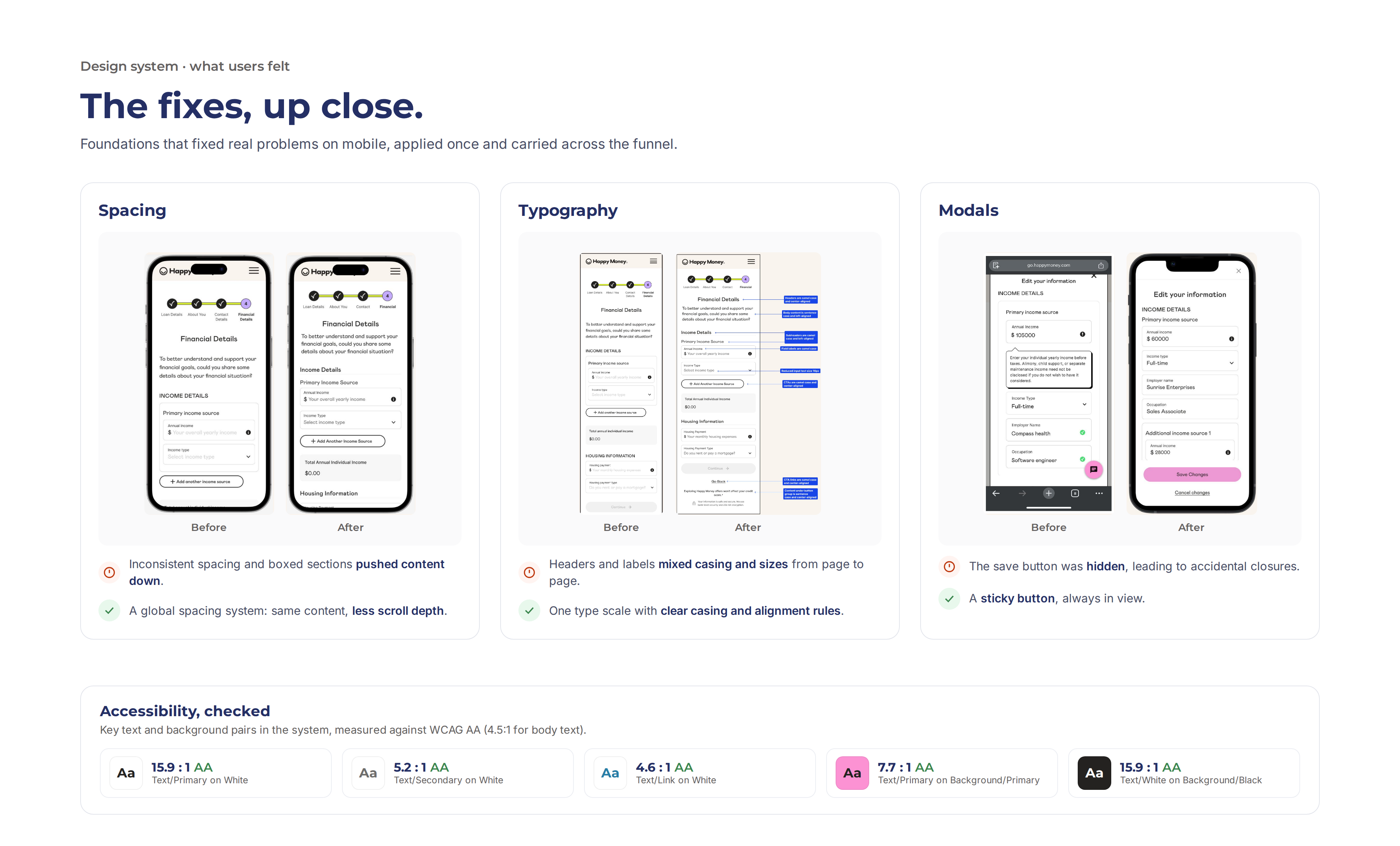
Built one page at a time. Each screen was designed and built on its own, so the same button, modal or card existed in several slightly different versions.

No single source of truth. Several Figma libraries overlapped, and no shared tokens, so designers and engineers made different choices for the same thing.

Small gaps that added up. Inconsistent spacing, cramped touch targets and low-contrast text crept in, making the experience harder to use, especially on mobile.


The offers page was working against borrowers. Every offer showed six details at equal weight causing analysis-paralysis.
On mobile, over 60% of our traffic, only two offers fit on screen. And because the amount dropdown was easy to miss, most people never changed their loan amount or learned what range they could get.
The offers page is where approved applicants either continue or drop off, so it drives how many loans get funded. It also had to absorb new business initiatives, like refinance, AutoPay discounts, and expanded terms, without a redesign each time.
One design had to handle every kind of offer: standard, refinance, AutoPay discount, refinance with AutoPay, and later six offers instead of four. It had to stay mobile-first, and it couldn't slide back into information overload.

FullStory sessions and surveys showed borrowers weighed APR(Annual Percentage Rate) (43%) and monthly payment (36%) far above everything else. My review of seven lenders, including Credit Karma, SoFi, and LendingClub, found most of them led with the headline numbers and tucked the rest into details.
Tool used: FullStory & Sprig
What I designed
🎯 A clear hierarchy
Rate and monthly payment lead each card, the other details sit a level below, and the offers fit on a mobile screen without scrolling.
🧮 One card, 20+ use-cases
Standard, refinance, AutoPay, and combined offers across mobile and web. Refinance compares against the current loan; AutoPay shows the discount at the moment of choosing.
🕹️ Simpler amount changes
A slider on desktop shows the approved range at a glance; on mobile, a far more prominent dropdown. The selected offer stays put when the amount changes.
⚖️ Room for more choice
With six offers, four stay on screen with "Show more" CTA for the rest, plus sorting by APR, term, and monthly payment.
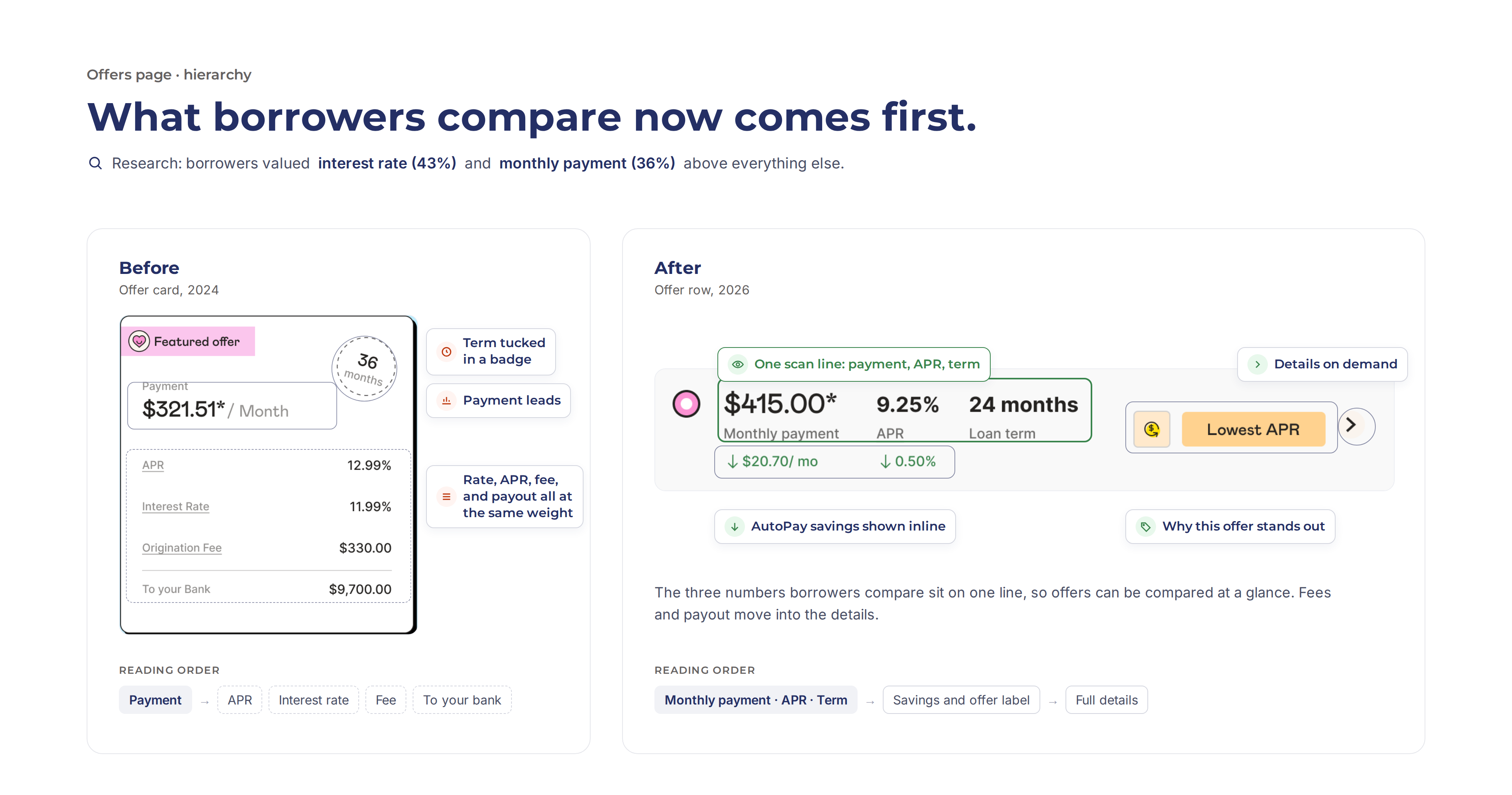
📈 Offers to verification lift: 21.0% → 36.0% n=110,646
The largest single step gain in the funnel that year.
📉 Time to decide: Reduced the time taked to finalize an offer from 2:35 sec → 0:53 sec
📊 95.5% desktop and 94.8% mobile chose the AutoPay-discounted offer over the same offer without it. Near-identical across devices, so the value came through on every screen.

There were several Figma libraries with overlapping, inconsistent patterns, no machine-readable tokens, and no shared component library in code. Every fix was manual and page by page, and engineers rebuilt the same components differently each release.
Engineering was rebuilding and debugging the same components differently every release. Partner white-labeling needed a scalable foundation, AI-assisted development needed a clean, tokenized system, and the upcoming rebrand depended on it.
UX audit results
😓 Components that were hard to use.
In modals, the action button could get hidden on small screens, so people struggled to finish or closed by accident.
♿ Components that weren't accessible.
Our audit found several components, and text styles used across many pages, that didn't meet WCAG AA.
↕️ Too much scrolling on mobile.
~60% of traffic scrolled 30–40% more than needed and hesitated at verification steps as important information was hidden.
🛠️ A system that couldn't scale or work with AI.
With no variables or machine-readable tokens, every component had to be translated to code by hand, and it wasn't efficient for AI workflows.
A design system is easy to dismiss as tech debt, so Treasure, our senior designer, and I presented it to design, product, and engineering as three connected bets: mobile optimization for near-term conversion, a design system foundation to stop rebuilding the same work, and an AI-enabled design process for speed later. The first and third depend on the second.
We asked for dedicated engineering time each sprint, and for product to treat mobile optimization as conversion work, not tech debt. Engineering agreed to an incremental plan, so the work moved without blocking the ongoing initiatives.

Audit: I reviewed every component in the funnel for usability and accessibility issues, and mapped the many versions of the same component. That showed what to fix, what to merge, and which variants to keep.

Global foundations: I standardized spacing, the type scale, and core components, and set up variables and tokens properly, from base to semantic, so the system works with AI tools as well as with people.

End-to-end flows: To make the whole funnel consistent, I used AI for much of the refactoring: it remapped screens onto the new components and got about 70% right on its own, and I cleaned up the rest by hand.
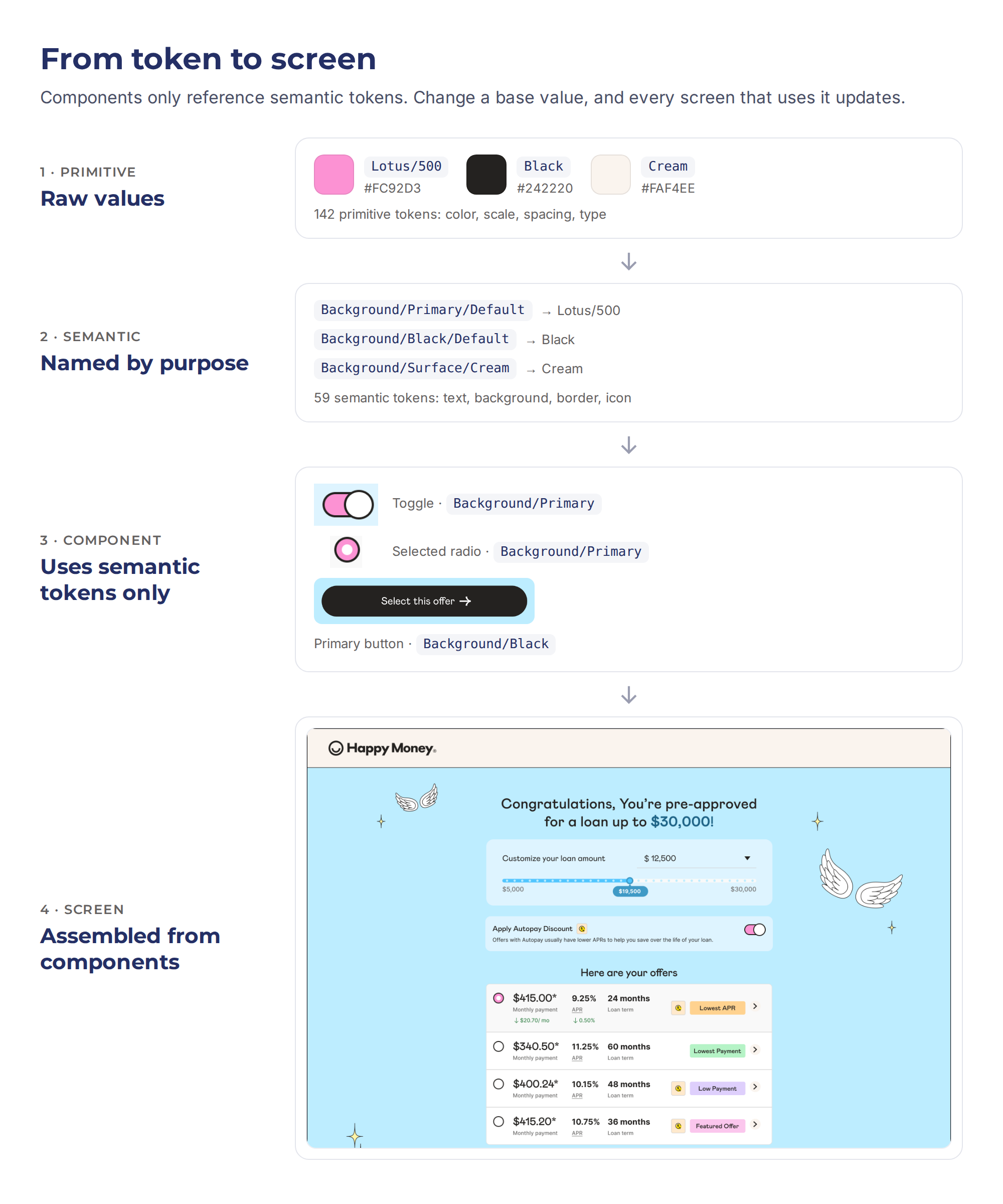
From setting up tokens to executing the rebrand. Tap a step.
What worked
Setup was fast: I exported the Figma tokens and Claude sorted them into a structured file in minutes instead of retyping them by hand.
What needed a human
The old system had no variables, and its Figma libraries were inconsistent, so they needed cleanup first.
What worked
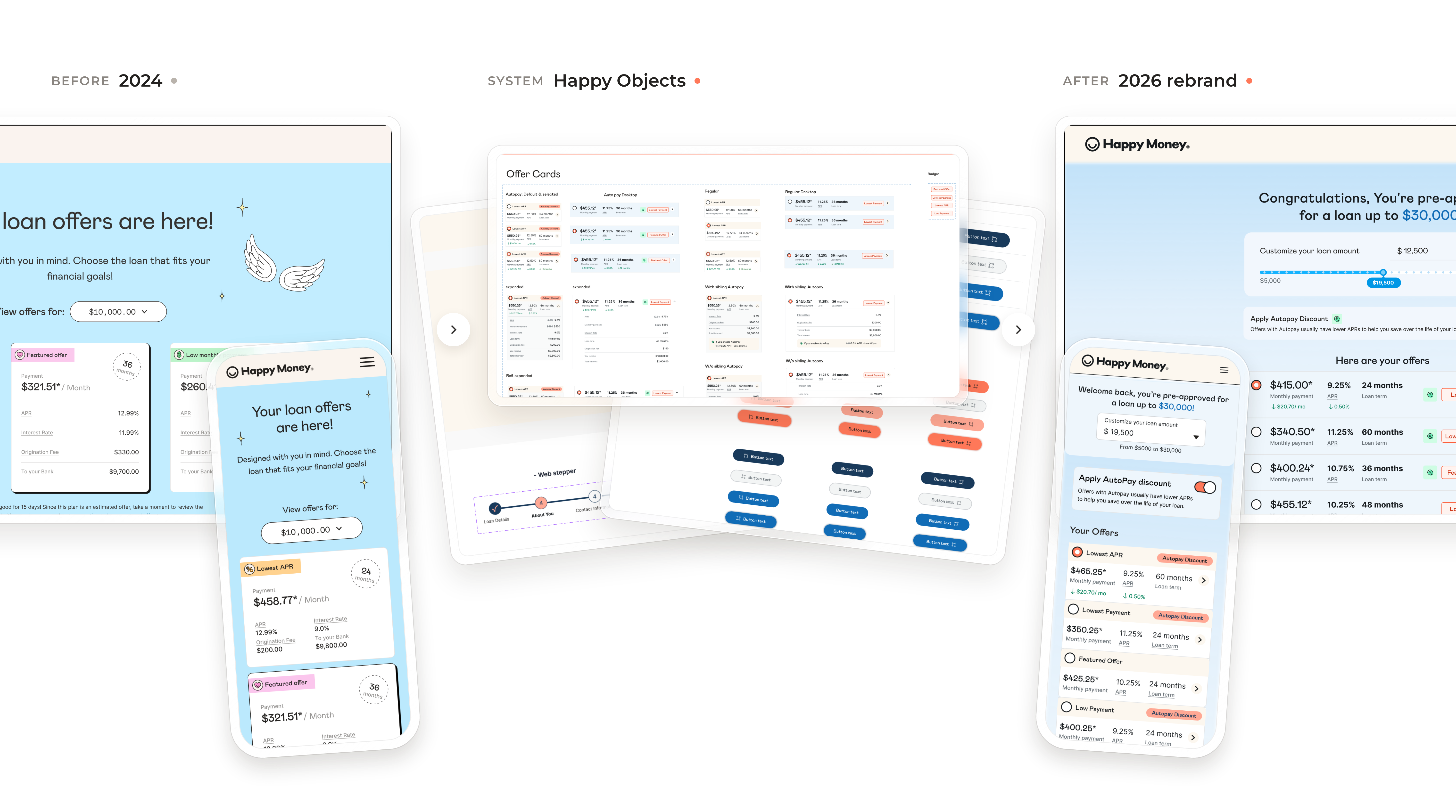
Components reference only semantic tokens, so changing a base value restyles every component that uses it. This paid off in the rebrand.
What needed a human
Some token mappings came out wrong and had to be corrected manually, some were missing and typography needed manual set-up.
What worked
Cursor recognized patterns well and mapped variants consistently, straight from Figma frames.
What needed a human
There was still a gap between generated and production-ready code, closed with manual corrections and handed off to devs for release.
What worked
AI remapped the funnel’s screens onto the new components and got about ~50% right on its own, the first time, then during the rebrand almost 70% of refactoring was handed by AI.
What needed a human
Since the old funnel didn't have uniform components & many detached ones, substancial manual effort was required the first time but for the rebrand only the remaining ~30% was manual cleanup.
What worked
AI refactored both the design system and the funnel with the least manual effort, using a Claude skill I built for the funnel refactor.
What needed a human
Some color combinations inside components didn’t map one-to-one to the new brand, so I updated those by hand. The funnel needed manual work too, because the rebrand changed the overall UI, not just the components.
♿ An accessible funnel
Every component and its interactions now meet WCAG AA, and so does the funnel built from them.
📲 ~30% less scrolling on most pages
From the new spacing system and tighter layouts.
🚀 Speed and scalability
This foundation is what made the rebrand realistic: AI enabled tokenized system, one refactor skill, and the funnel moved to the new brand without redesigning it page by page.
🔄 One system across the funnel
A fix to a button, spacing rule, or touch target now lands everywhere at once.


Linking a bank account is one of the most fragile steps in the funnel, and nearly one in four borrowers skipped Plaid, the fast option, for the slower manual path. The page was part of the problem, and so was what happened when something failed.
Linking through Plaid means faster funding decisions and less manual review. Every skip pushes a borrower into a longer verification process.
Heatmaps, session recordings, and funnel analysis in FullStory showed error states were a major cause of drop-off, bigger than the page layout itself. So the job wasn't only to improve the happy path, but to make sure every failure had a way back.
This was also the first flow redesigned mobile-first on the new design system. I removed illustrations that added white space without meaning, and it became the proof that the system worked.
🎯 Skipping looked like the next logical step
"Skip for now" was so prominent it read as the way forward, not an option that leads to longer verification. I made it clearly secondary.
🧮 No reason to link
Nothing explained why linking mattered or why Plaid beat manual entry. I added a short explanation of both at the point of choice.
🕹️ Weak trust signals
Plaid is used by major banks and fintechs, and borrowers' login credentials are never shared with Happy Money. Now the page says so.
⚖️ Requirements read as obstacles
Routine rules, like the account name matching the applicant, became upfront guidance so borrowers know what to expect.
⚖️ Fixing the failures
Borrowers could fail to link for many reasons, and almost every one ended in the same generic "Something went wrong" pop-up with no way to try again. I mapped each failure to its own state with a specific next step: try again, reconnect, or link another way.
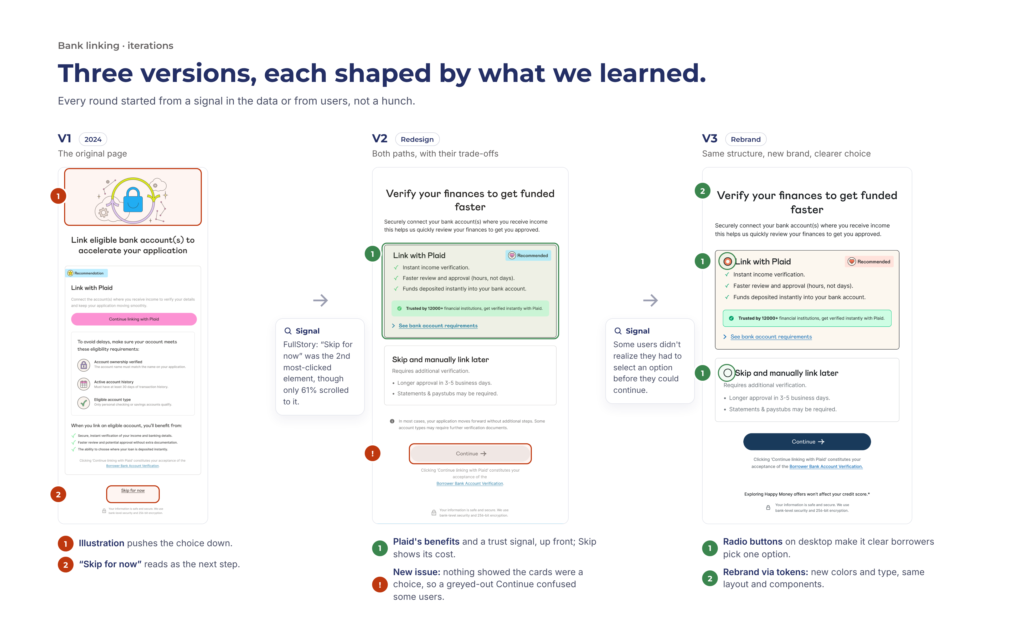
📈 Plaid selection increased from: 76.5% → 86.5%
In other words, skips fell from 23.5% to 13.5%. Every borrower who links through Plaid gets a faster funding decision and avoids manual review, so this is fewer delays for borrowers and less manual work for the team.
📉 Verification completion: +11.7pp (52% → 64%)
More borrowers finishing verification means more applications ready to fund, at one of the most fragile steps in the funnel.
📊 Error recovery: almost none → ~64%
About 64% of borrowers who hit a Plaid error now recover and finish linking. Before, the generic "Something went wrong" pop-up gave them no way forward.
Mobile UX
Data analytics
Data driven process leveraging analytics to improve the error resolution within the payments flow in the money transfer app.

.gif)


